Sabtu, 09 Februari 2013
Jumat, 01 Februari 2013
Mengenal Arsitektur Komputer
GPU = Graphics Processing Unit;
AGP = Accelerated Graphics Port;
HDD = Hard Disk Drive;
FDD = Floppy Disk Drive;
FSB = Front Side Bus;
USB = Universal Serial Bus;
PCI = Peripheral Component Interconnect;
RTC = Real Time Clock;
PATA = Pararel Advanced Technology Attachment;
SATA = Serial Advanced Technology Attachment;
ISA = Industry Standard Architecture;
IDE = Intelligent Drive Electronics/Integrated Drive Electronics;
MCA = Micro Channel Architecture;
PS/2 = Port yang dibangun IBM untuk menghubungkan mouse dan keyboard ke PC
Design a Professional, Clean Community Blog Theme in Adobe Photoshop
Tutorial Details
- Program: Adobe Photoshop
- Version: CS4 and higher
- Difficulty: Intermediate
- Estimated Completion Time: 3-5 hours
Final Product What You'll Be Creating

About the Design
Today we’ll be looking at the design for Alex Pascal’s “Revolution Magazine” theme for WordPress. The fully coded version is available on ThemeForest as a WordPress blog theme.Revolution Magazine is clean, modern, premium WordPress magazine, which also doubles as a community blog, personal blog, or whatever you shall use it for. If you have been looking for the spark to ignite your plain old blog into a popular magazine, you have found it.
It all starts with the design though, and Alex is going to walk us through how he approached the design phase of this project. As this is just a design tutorial, he won’t be going into the theme-coding, but remember that you can check out the Revolution theme at ThemeForest to see a live example. There are also a bunch of great WordPress Theme coding tuts over at Nettuts (like this one). We hope you like it – let’s dig in!
Step 1
Go to File > New > then set the height to about 2000px, the width to 1400px, and the resolution to 72dpi.

Now let’s fill our background with a solid color. Select the layer “Background,” right-click on it, and choose “Layer from background” and give it a name. Now, using the Rectangular Marquee Tool (M), create a selection over the whole canvas and fill the selection with #d0d0d0.

Step 2
We will now create a header background. Create a new layer and call it “header”, then grab your Rectangular Marquee Tool (M) and make a selection at the top of your canvas spanning 175px high and fully across the canvas and fill it with any color. Double click on the layer you have just created and click on “Gradient Overlay” > existing gradient image > then set the right-most color to #383838. Position the left color at about 60% and change the color to #2D2D2D.


Step 3
A web site is nothing without a navigation, and a good one at that! Let’s now create a navigation bar that blends in with our existing header background.Navigation
Create a new layer and call it “Vertical Gradient” and grab the Rectangular Marquee Tool (M) and make a 960px by 40px selection 115px from the top of the canvas, leaving about 20px underneath the selection for the background and fill it with any color. You can then add the Layer Styles shown in the image below to the layer you have just created.


Download this home icon, open it in Photoshop, and import it into your existing canvas. Resize it to about 18px by 17px and fill it with #999999. Center it in the previous layer you have made and now you have a stylish home link!
Next we are going to add navigation items to our navigation! Grab your Horizontal Type Tool (T), set the following styles below, and type in a menu item. In our example, the first item is “Documentation” with a description of “theme support & guide”. Add as many items as you’d like, leaving a padding of 20px between each menu item.

Social Media Icons
For the next step, we are going to need social media icons. We’ll start by downloading this set of social media icons, by KomodoMedia, and then placing four icons and desaturating them (Shift + Ctrl + U) like in the image below.
Step 4
Now that the entire header is done, we are going to keep going on to the body of our site.Main Body
For starters, we are going to divide the body into two halves — one for the main body content and the other for the sidebar. Create a new layer, call it “main body” and make a selection with the Rectangular Marquee Tool (M) 640px wide and as tall as you want (at least 1000px or so), starting directly below the header background. Fill this selection with #ffffff. Now create a new layer, call it “sidebar” and make a selection 320px wide on the right of the “main body” layer and make it as tall as the main body. Fill it with #e6e6e6.

Featured Slider
Create a new layer and using the Rectangle Marquee Tool (M), make a 960px by 360px selection right at the top of our body, directly beneath the navigation and fill it with #e6e6e6. Create another layer and leaving a 25px margin on all sides, inside the previous selection, make a 910px by 312px selection and fill it with #ffffff. In Layer Styles, add a 1px #dddddd inner stroke on this layer.

Proceed to adding the styles shown in the image below to the “tab_hover” layer.


Step 5
Whew! We’re almost there! With the hardest part out of the way, let’s continue onto the body of our site. In this step, we will discuss key techniques such as spacing.Let’s begin our “Latest Post” section with a post. Let’s make a border by making a 615px by 210px selection with the Rectangle Marquee Tool (M), filling it with any color in a new layer called “border” and then adding a gradient described in the image below. As soon as we’re done with that, insert a 610px by 200px image, leaving 5px padding within the frame. The image is not important, so once again, you can use whatever you would like as a placeholder!


Step 6
Almost as vital a part as any in a community blog theme, the sidebar! For demonstrative purposes, we will just design a few generic widgets — obviously it would be impossible to cover a custom design for every widget out there but most of these will allow the creative juices to flow to create more!For this part, we will need to download the free Icon Pack from Graphic River and import the RSS 48x48px and Twitter 48x48px icons into our project. Position these icons 20px away from the left side of the sidebar and make sure they are aligned vertically with the first post on the left.
Grab the Horizontal Type Tool (T) and type in a random number for the subscribers and followers using the Georgia font, and the words “subscribers” and “followers” in Arial as described in the image below.

Finally, type up a quick Text Widget with the Horizontal Type Tool (T) using the styles provided in the image below.


Step 7
Now we’re slowly wrapping up this site with… you guessed it, the footer! Let’s prepare our footer by creating a quick background for it. Grab the Rectangle Marquee Tool (M) and create a 960px by 510px selection in a new layer, directly beneath the main body background. Fill this selection with #2d2d2d. This will serve as our footer with 4 columns in it. Directly beneath this block of color, make a selection 960px by 60px and fill it with #1d1d1d and put it in a new layer. This will serve as the “copyright” portion of the footer and a simple but effective way to signify the end of the page.

Conclusion
Congratulations, you have just designed a clean, community blog theme in Adobe Photoshop. Hopefully you have learned some tips and tricks on how to design certain aspects of cleanly organized sites and are able to use these skills in projects of your own in the future!As this is just a design tutorial, I haven’t gone into the theme-coding at all, but you can check out the Revolution theme at ThemeForest to see a live example.
Good luck and thanks for reading! :)
How to Create a Grunge Web Design in Photoshop
Tutorial Details
- Program: Photoshop
- Difficulty: Intermediate
- Completion Time: 2-3 hours
Download Source Files
- Source files for this tutorial are available to Premium members.
Get a Premium Membership
Final Product What You'll Be Creating

Step 1
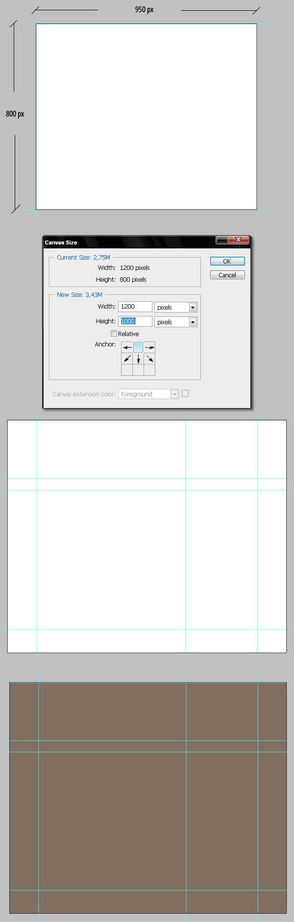
This time we’re going to create a full web design in grunge style using Photoshop and a lot of stock images. As this is a intermediate to advanced level tutorial, I’ll skip the explanation of some basic steps. First create a new document 950 px by 800 px at RGB 72dpi. Show the rulers and drag four guides bounding the document, this will be the optimal area of the design. I’m planning to keep a fixed width layout.Go to Image > Canvas Size and increase the width and height a lot more, 1200 px by 1000 px is OK, this way we’ll be designing for wider screen resolutions. Then add more guides where you’re planning to add the containers (Header, Navigation bar, Sidebar, Footer).
Let’s imagine this design is destined for a WordPress template, so we’ll need a header, a navigation bar inside the header, and a right sidebar. Take a look at the bottom of the following image. Then fill a background with this color #7A8173.
Step 2
Now we’re going to create a pattern for the header’s background, which is fairly simple. Create a new document 50 px by 300 px and draw something like the image below. I’m using guides to make my shape as symmetrical as possible. Then go to Edit > Define pattern and save the shape as "pattern 1."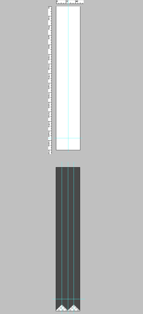
Step 3
On a new layer in our main design file, draw a 300 px height rectangle using the Rectangle Tool. Go to Filters, and add a Pattern Overlay, search for your brand new pattern and apply it. To make it look correct you must click the Snap to Origin button. Change the layer Fill to 0%, create a new blank layer above the shape layer, and merge both, this way you’ll have the pattern ready to add some effects to it. Name that layer "Pattern 1."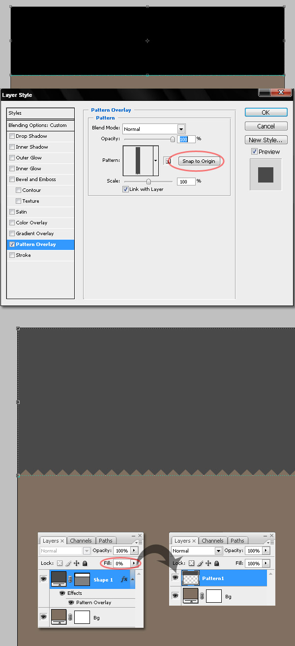
Step 4
Select "Pattern 1" layer and apply to it some layer styles: Drop Shadow, a Gradient Overlay, and a Pattern Overlay. Try to get something similar to the bottom of image below, using following values.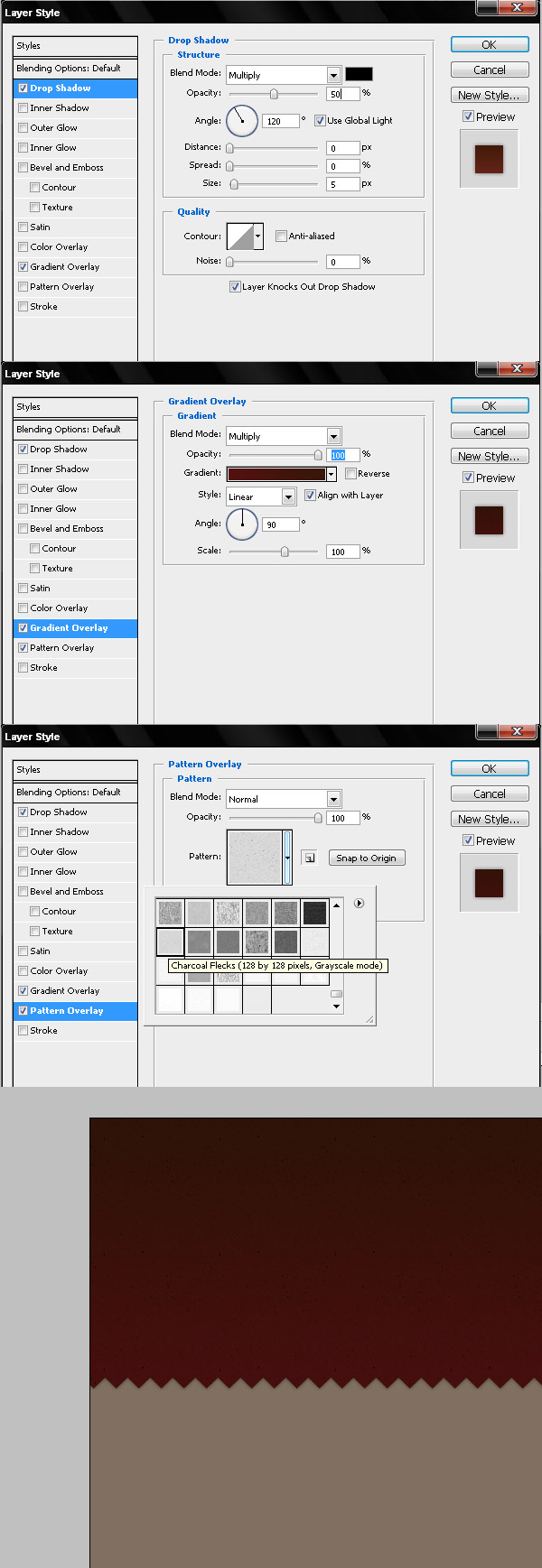
Step 5
Now we’re going to add the navigation bar background. Draw a rectangle hiding a little bit of the "Pattern 1" layer. Apply to that rectangle a Pattern overlay, a black to red black gradient overlay, and a soft Drop shadow. Use the values of the images below as a reference. Next, add a Layer mask > Hide all, and draw a black to white to black Reflected Gradient on the layer mask, you’ll get something similar to the bottom image below.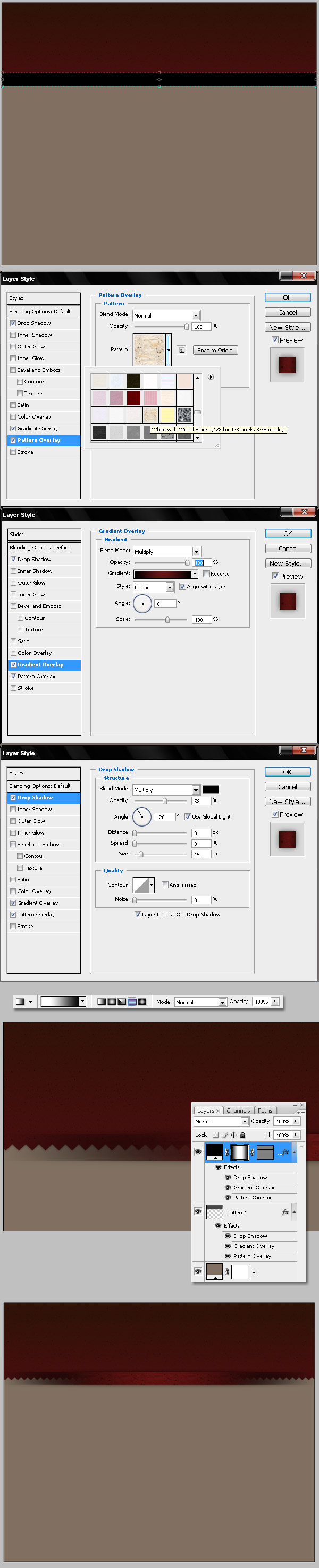
Step 6
Now draw an ellipse (#691E1B) above the "Pattern 1" layer, name it "Light," and Apply a Gaussian Blur to it with a 50 pixels radius. I created an extra guide to draw the light in the center of the header. Delete everything below the navigation bar and change the layer’s Blending mode to Color Dodge.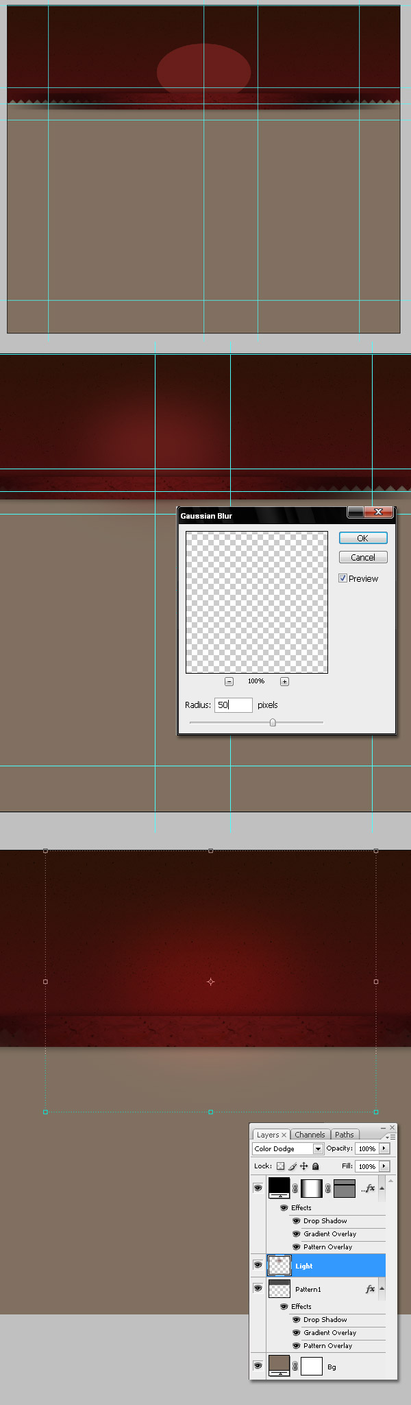
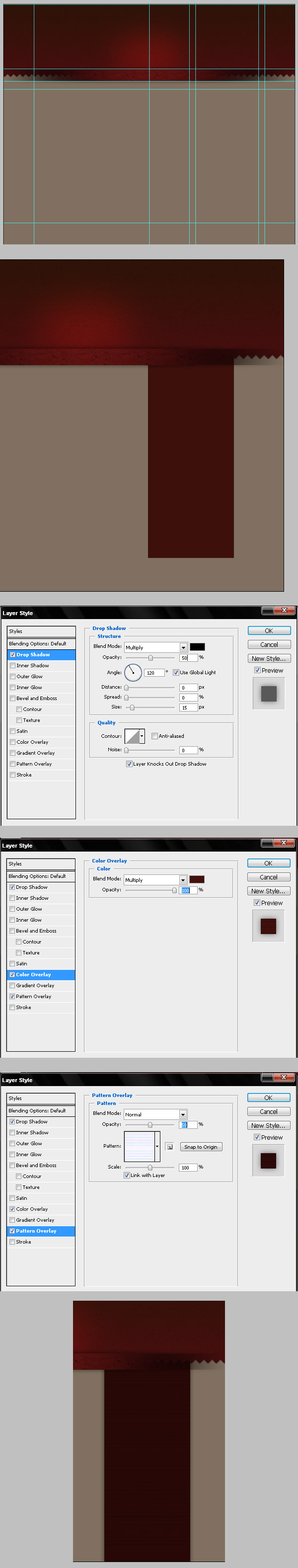
Step 7
To finish the first part of the layout, we’re going to draw the sidebar’s background. Draw some guides to delimit the sidebar and also edit the existing guides to make them fit on the actually design. Then draw a red rectangle (#3D100B) and apply the following styles: a Drop Shadow, a Color Overlay, and a Pattern Overlay.At this point, you must consider the way you’re going to cut the image into HTML + CSS; that’s why I’m using Drop shadows with 0px of Distance the most of the time, and only horizontal or vertical gradients. The texture in this case has many horizontal lines. It needs to be easy to convert this into a repeating background for many areas. Also ,this is a good point to take a break and organize the layers in your folders to keep things organized.
Step 8
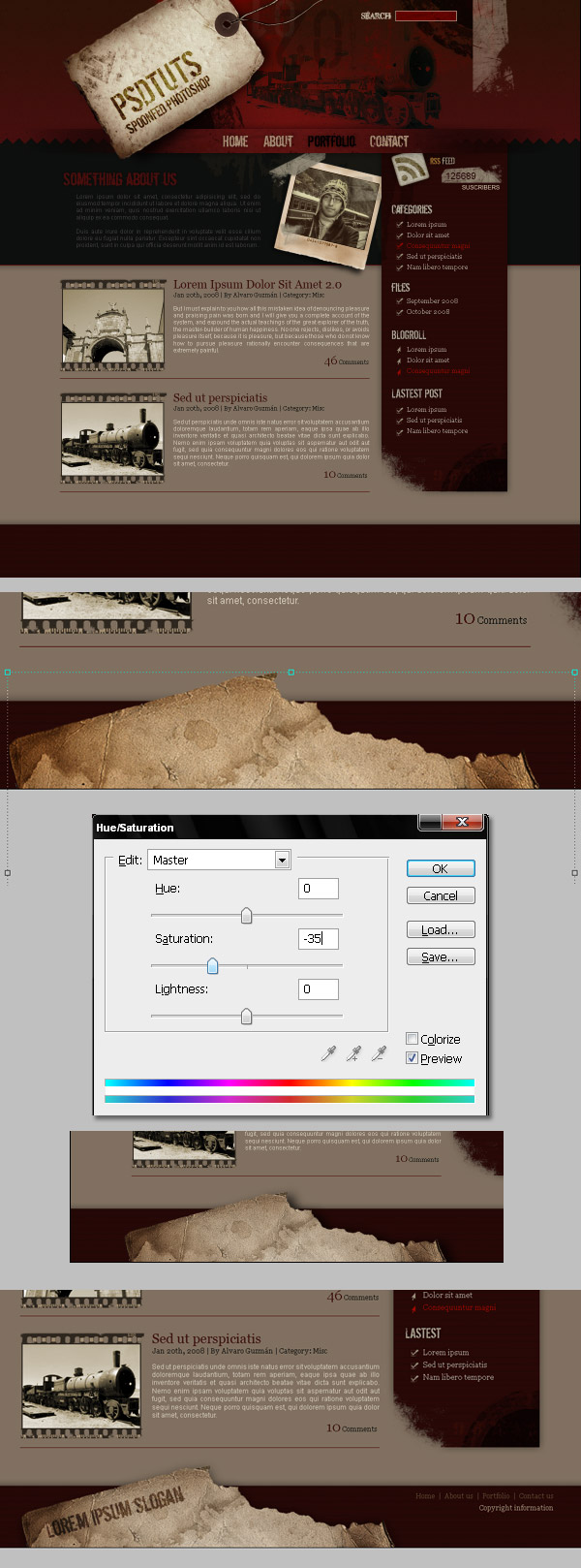
Now begin with the details, I want to add the site name in a prominent place, that’s why I will use this nice grunge label image. Obviously you must extract the label and place it in the top left corner of our design. Try to get something like the first image below. Next, use the Magic Wand tool to select the little brown circle, then Command + Shift + I to inverse the selection. Adjust the Levels and Hue/Saturation using the values shown below.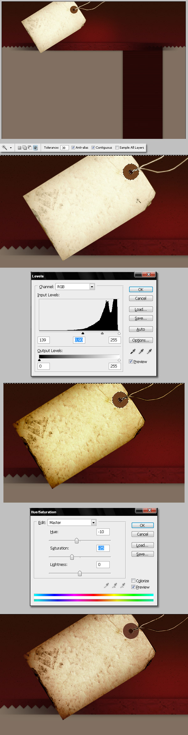
Step 9
Now using the Eraser tool and an irregular Brush, delete some areas of the label’s border. To add a paper cut effect, select the Dodge tool and use the same Brush shape to apply the dodge to the label’s border.
Step 10
We’re going to add a shadow to our label next. For this, duplicate the "Label" layer, change the Hue/Saturation > Lightness to -100, and apply a Gaussian Blur with a 10 px radius. Next, change the "Label copy" Blending mode to Multiply and set the Opacity to 75%.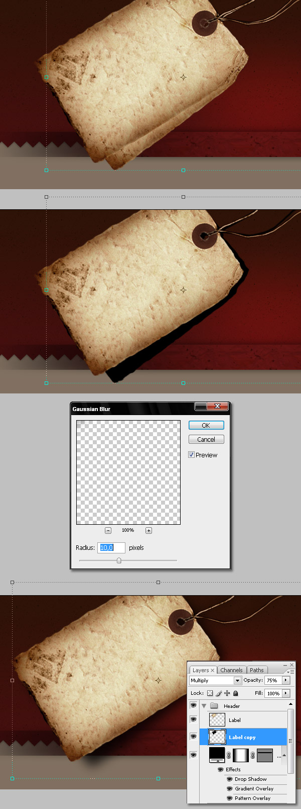
Step 11
A last retouch for the label, change the Saturation to -40 to make it more gray.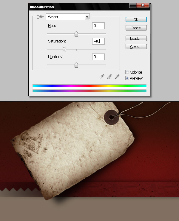
Step 12
Now we’ll add some support images, try to find images surrounding a concept, but as this is a tutorial about the techniques, I’m choosing a random one. This one is a beautiful picture of a vintage train here in the highlands of Bolivia. Extract the shape of the train however you want. Then change the "train" layer’s Blending mode to Darken.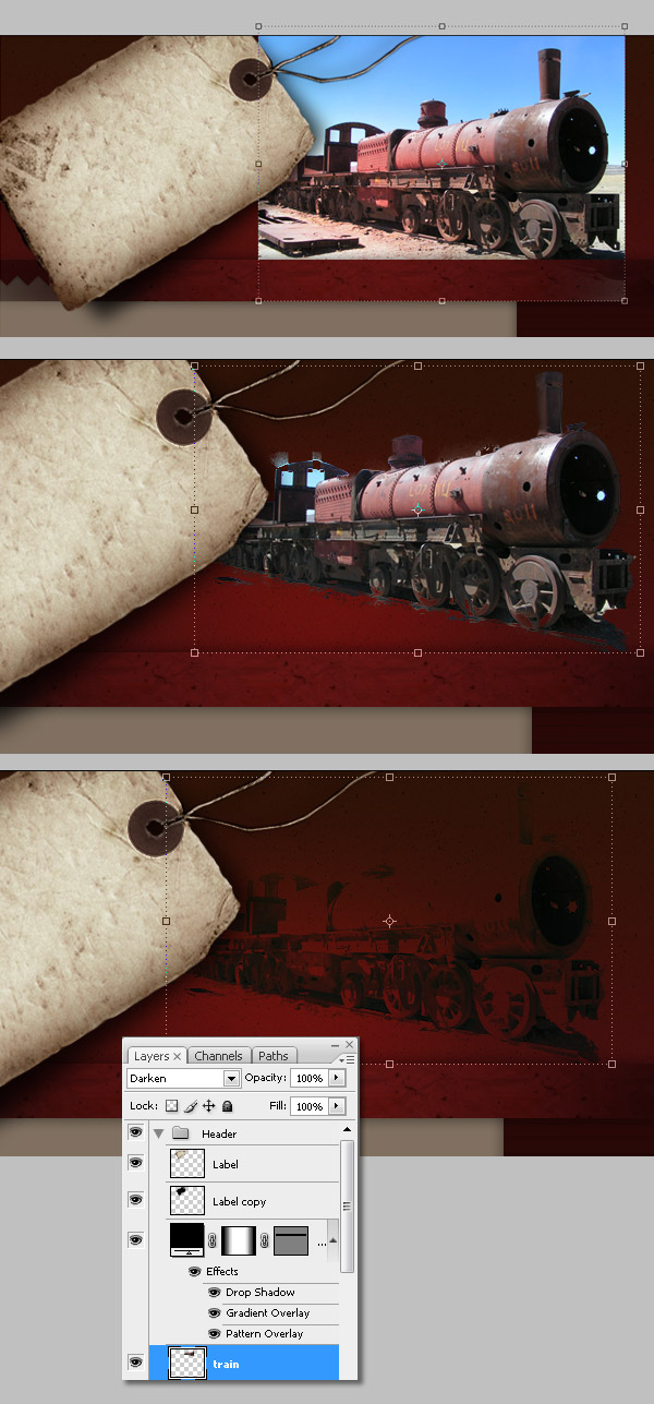
Step 13
Let’s add some text, first the page name. Type something using a grunge font; you can find some interesting ones over here. For the title use a black type and change the layer’s blending mode to Overlay, then duplicate the layer and change the copy’s Opacity to 75%. To get a tiny blur effect, move the copied layer one or two pixels left or right. Add more text using this technique, like a slogan or something. Also, it’s a good moment to add the navigation links as well.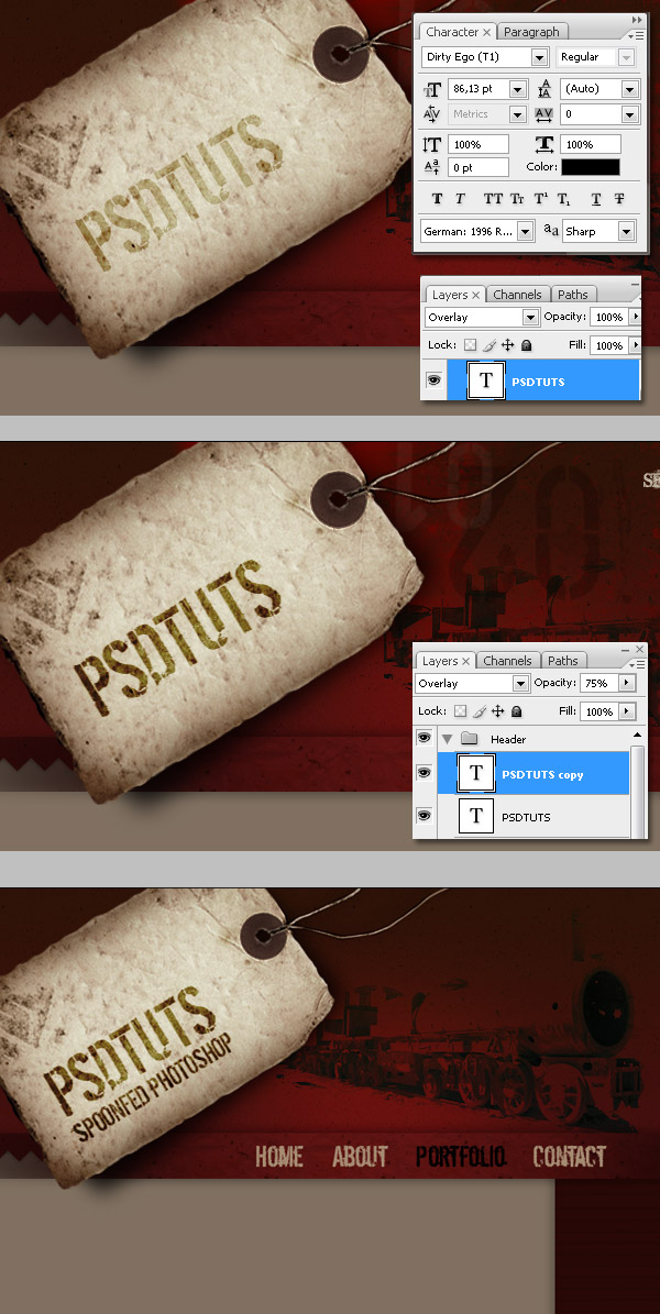
Step 14
Now add more stuff, it’s grunge style! I downloaded some Jenn B’s brushes from here, these brushes have restrictions. Using those brushes add some numbers, corners, masking tapes and whatnot, feel free to do whatever you want in this step. Just remember add all the layers below both the "Label" and "Label Copy" layers.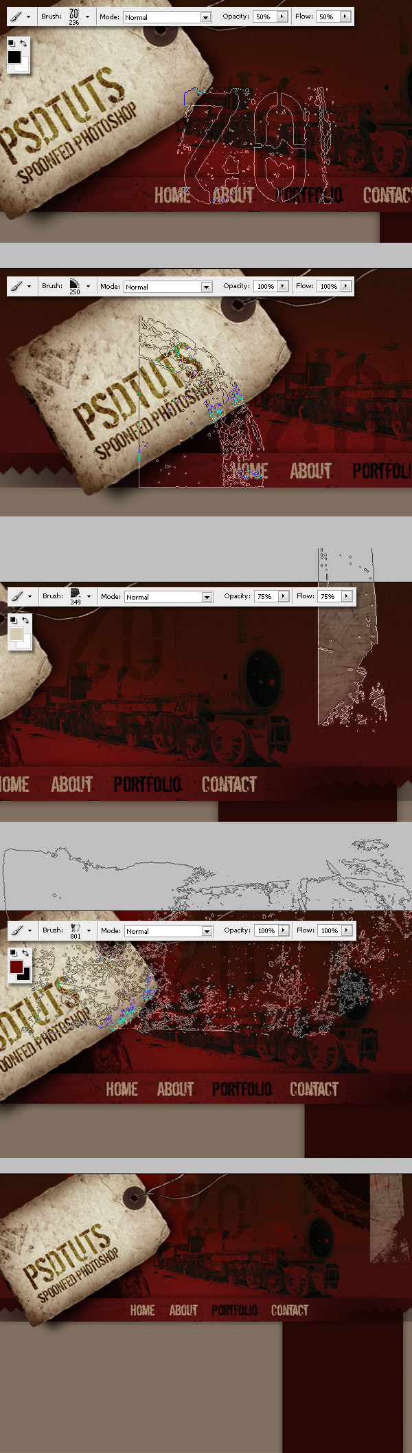
Step 15
Now we’ll start adding the page sections. First of all, in the header we’ll need a search bar. Type a search label. Next, draw a red (#6A0400) rectangle as a search input field, then apply a Stroke and a Pattern overlay layer effect.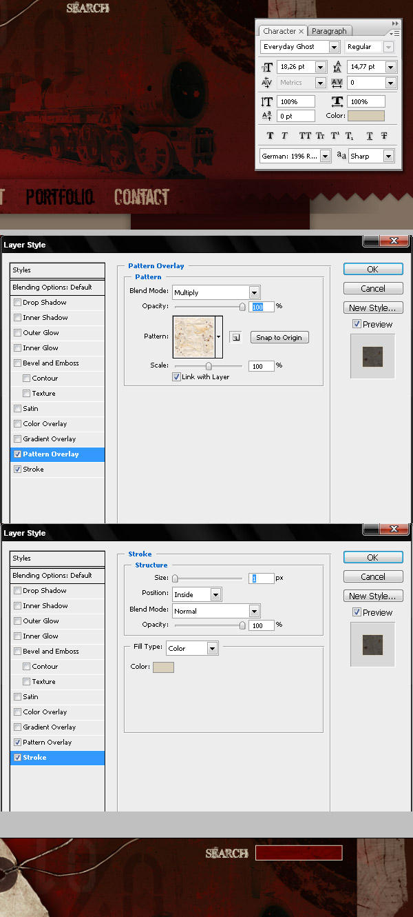
Step 16
Now we’ll start adding the main content of our design. First we’re going to add a field to put some featured text on. Draw a dark gray (#0D0F0E) rectangle into a layer below the sidebar. I created four folders to keep the layout organized: One for the "Header" above everything, one for the "Sidebar" below the "Header," one for the "Content" below the "Header" and "Sidebar," and the last one for the "Footer."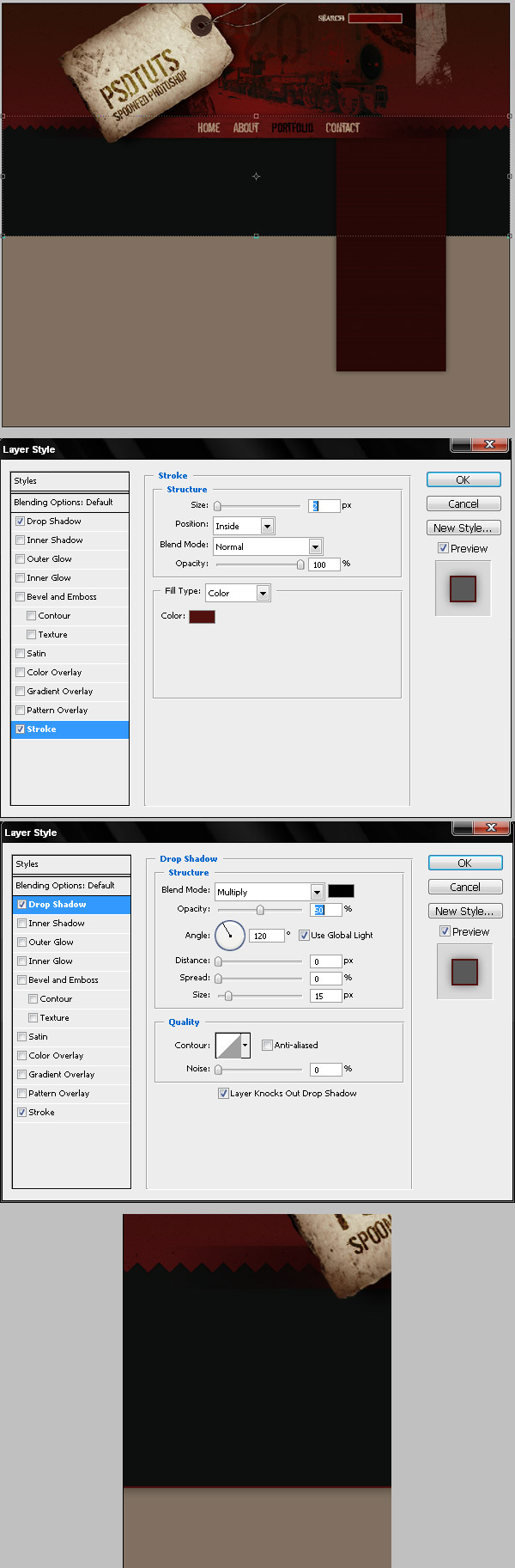
Step 17
Download some grunge corners and borders from here, and paste one over the gray background. Next, apply apply an Overlay effect to the corner with a color of #171612. Also, add another corner over the sidebar’s background, but this time bring down its Opacity below 25%.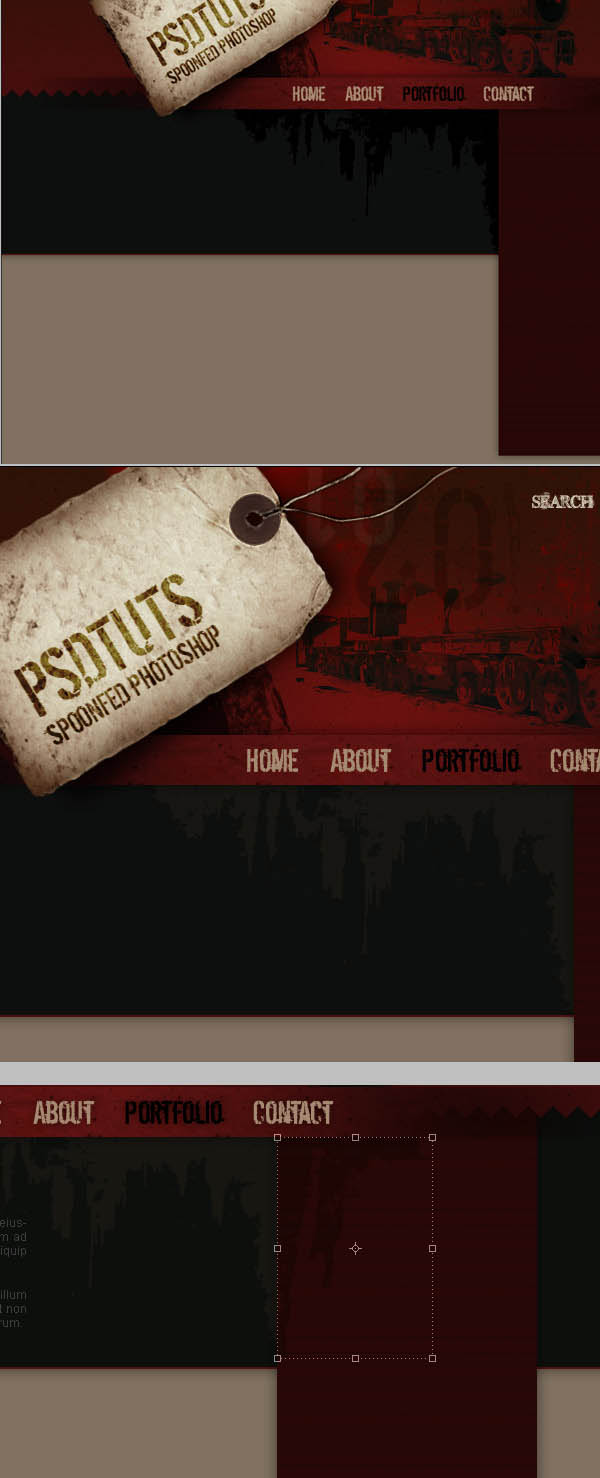
Step 18
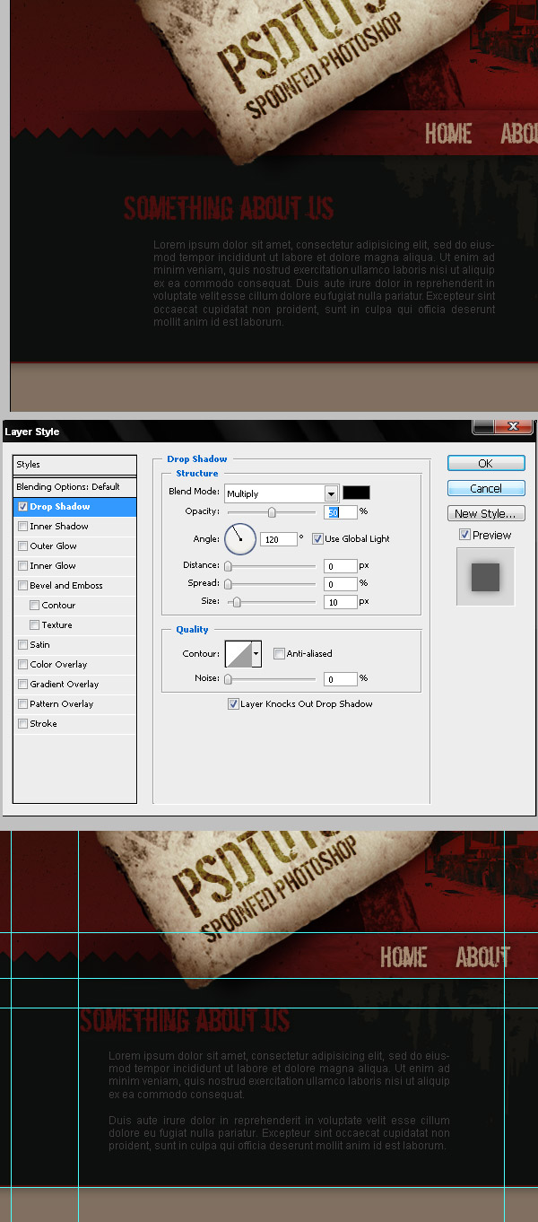
Let’s add some text. You can add any sample text, imagine that it’s javascript driven text recent posts section, or a featured post section, something like that. I’m using the same grunge display typeface as used for the navigation bar with the color #4D0D0D and Arial with a color of #3F3F3F for the body text.Apply a drop shadow effect to the title and add the same effect to the navigation items as well. When you convert this PSD into an HTML + CSS file, you’ll need to convert these titles to images, so it’s OK if you want to add more styles to them. Finally, use some guides to put the text layers into a proper place.
Step 19
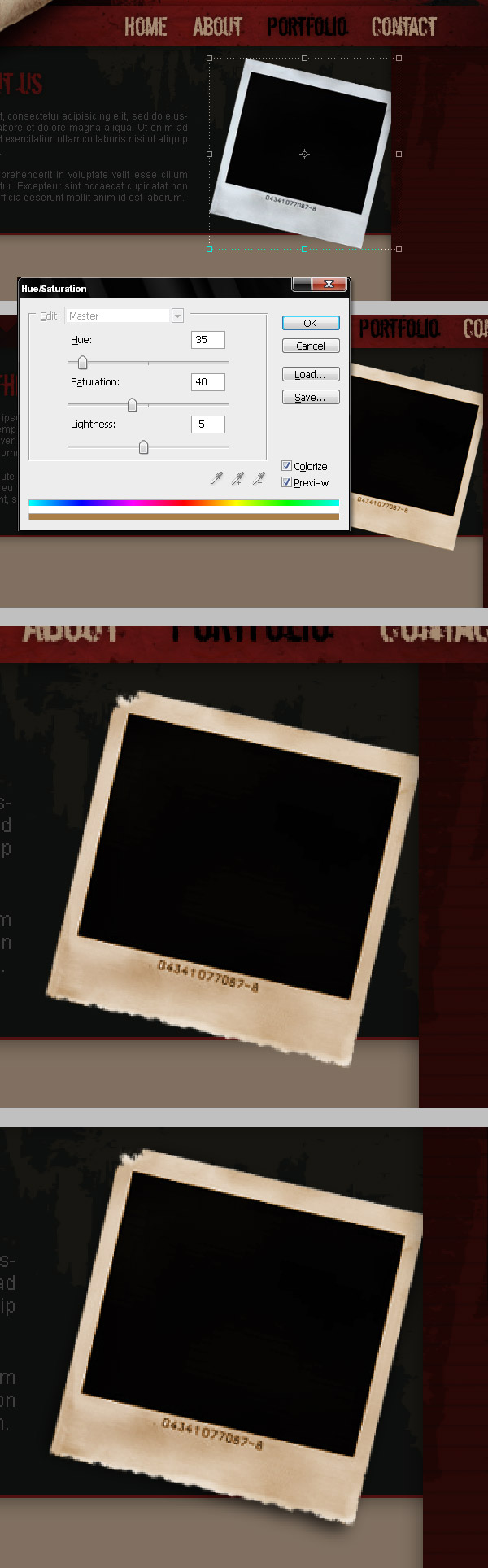
Our featured bar is looking a little empty, so let’s add a support image. In this case, I used a polaroid shot. You can download the polaroid picture from here. Extract the polaroid, paste it into a layer above the gray background and the grunge corner on the "Content" folder, then change the Hue/Saturation to make the polaroid a little more sepia (Select the Colorize option).Use the same techniques for the "Label" layer’s edges (Step 9). Erase and Dodge the edges of the Polaroid picture. Finally, add a drop shadow using the same technique as used in Step 10 of this tutorial.
Step 20
I had this sepia picture of myself so I’m adding it to the design. Add any image into a new layer above the "Polaroid" layer, select the black square of the polaroid, then Command + Shift + I to inverse the selection. Select the picture layer and Delete all the extra. Next, you can add more grunge details, like some masking tape over the picture, as shown in the images below. I applied a 1px Drop Shadow effect to the added tape as well.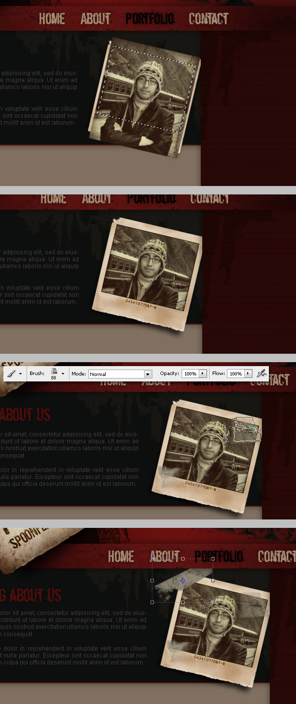
Step 21
It’s a good moment to add a RSS icon to the sidebar. Draw a Rounded Corner Rectangle (#99917E), then apply the following effects to it: an Inner Glow, a Pattern Overlay, and a Drop Shadow, use the values shown in the image below. Next, draw or paste into a new layer above the rectangle the standard RSS shape and fill it with black. Finally, change the "RSS shape" layer Blending Mode to Overlay.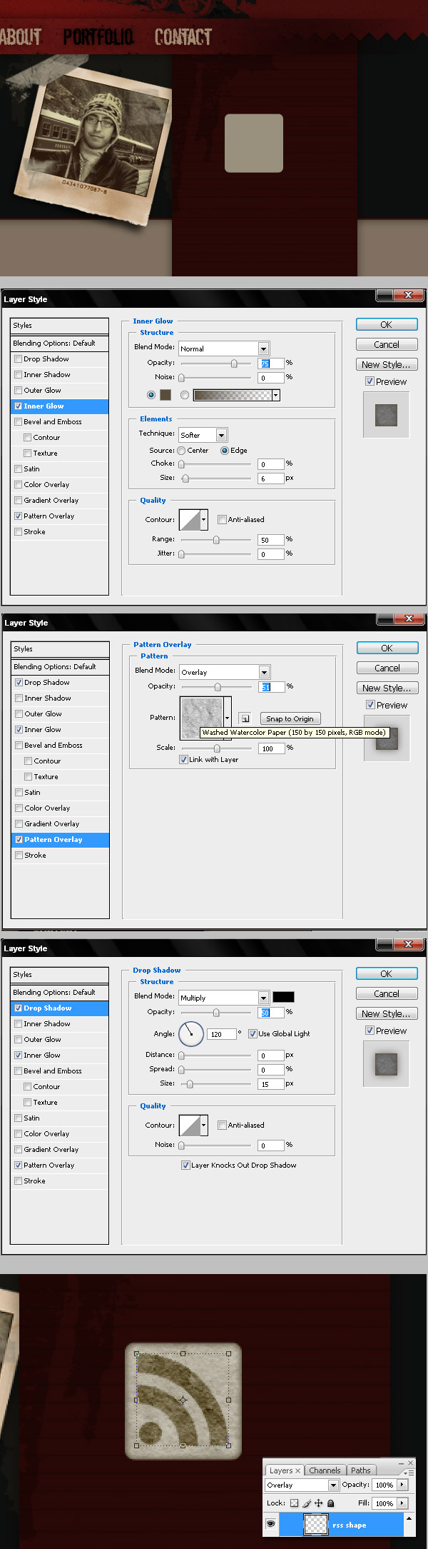
Step 22
Now place the RSS icon on the sidebar’s top left. Add some text like "RSS FEED." Draw another piece of masking tape, and write the number of subscribers over it. Remember, now we’re working in the "Sidebar" folder.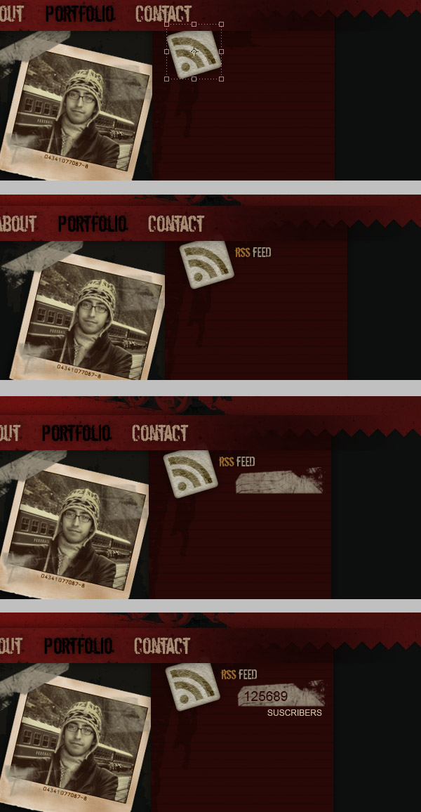
Step 23
It’s time to add a single post to our design. Just write some random text as a Title, another line for the date, category, and author. Also, some words as the text of the post. Typography is the most important in this step. I love to use Serif fonts for the titles and Sans-Serif for the body, but is just me. Decide what you feel is best for your design.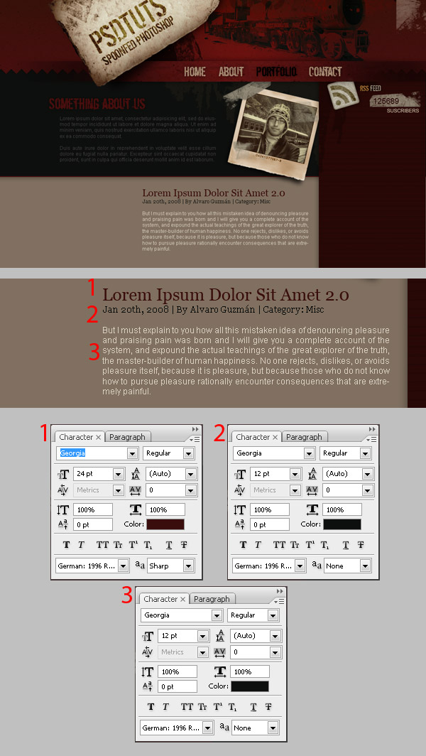
Step 24
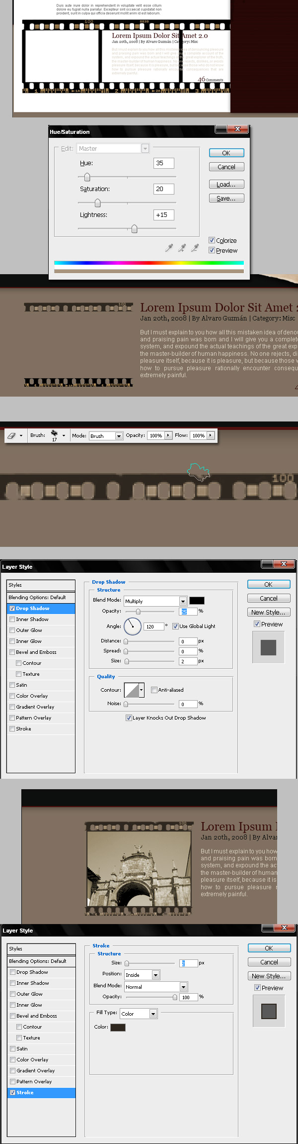
To give our sample post a little more attitude, we’re going to add a preview image, just like in the TUTS sites, but as this is a grunge design we need to add a grunge background to our images. This is as simple as adding padding top and bottom with CSS, then setting a repeating background image.This image will be of 35mm film. Extract two small stripes from the film, and change their Hue/Saturation using the values in the image below. Next, using an irregular Eraser, Delete some areas of the stripes. Finally, add a Drop Shadow to each stripe. When you have finish with the film, paste any image below the film layers. I’m adding a picture of one of my travels. Finally, apply a Stroke Effect (#2F261D) to that image.
Step 25
Draw a 2px red line below the post and some text for the comments, it’s a good idea to add all the post related layers into a new folder called "Post." Then increase the height of the document a little bit, you can do that by using the Crop tool, do this just to see how our design will look if it has two or three posts on it. Duplicate the "Post" group, and change the text and the image, as shown below.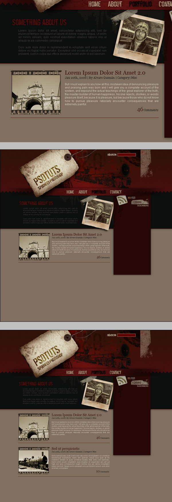
Step 26
Actually it’s looking pretty good, now add the titles of Sidebar’s items. Yo can create a folder for each item as well.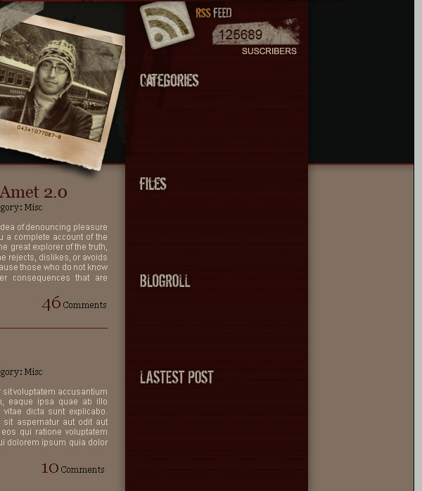
Step 27
Now add a list icon. You can use any Custom shape. Add some random text, I’m using Georgia for the sidebar. Duplicate the icons and edit one to represent the hover state. Do the same for each Sidebar item.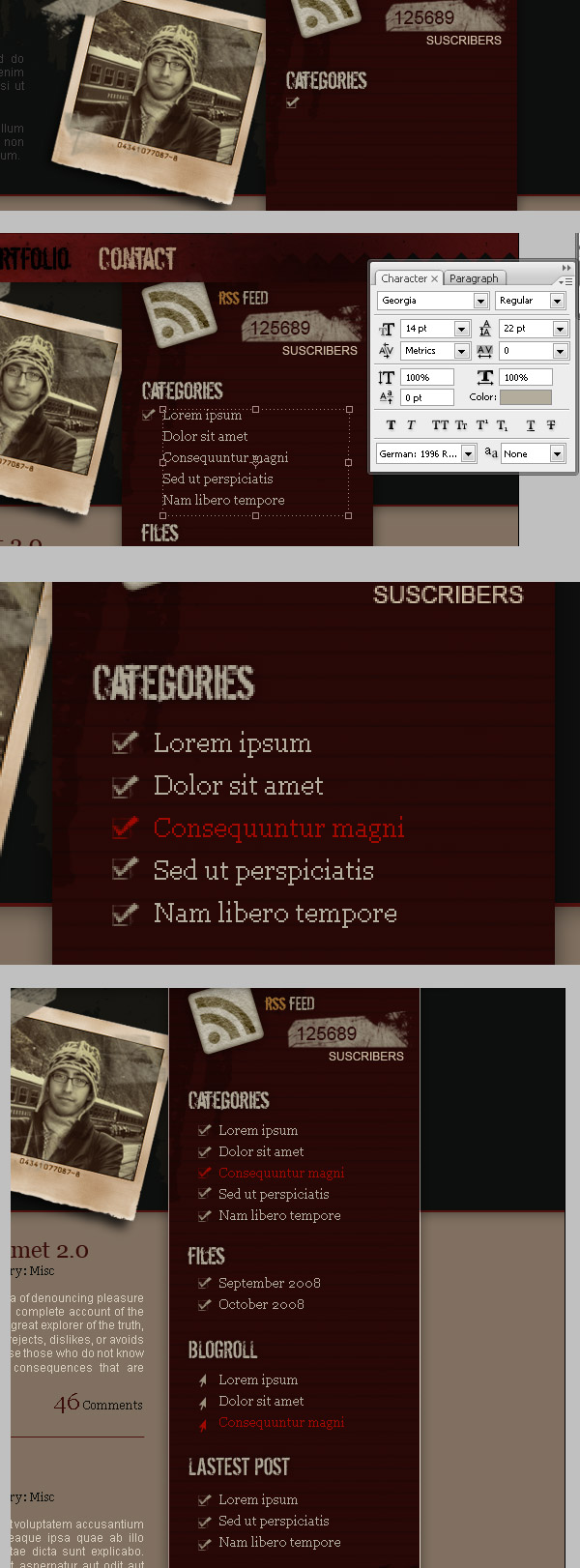
Step 28
We’re close to finished. Add some grunge details at the bottom of sidebar, by adding some grunge brushes into a new layer above the sidebar’s background layer. Select the Sidebar’s background layer, then go to Layer > Layer Mask > Reveal all. Next, hide some areas of the bottom left of the sidebar’s background using an irregular black Brush.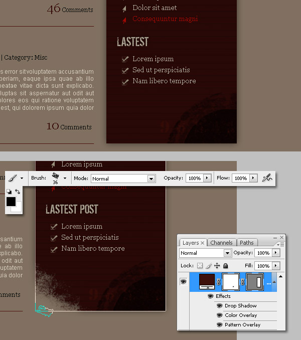
Step 29
Finally, select the Sidebar’s background layer and copy the layer style of it. Draw a rectangle at the bottom of the design inside the "Footer" folder and paste the layer style into it. Next, extract and paste this image above the Footer’s background.Adjust the saturation to make it a little bit more gray. Also, you can apply to that sheet of paper a drop shadow repeating the technique of Step 10. Add some text over the piece of paper, maybe a Slogan or something. And also add some footer text, like a quick navigation bar, and the copyright information.
Conclusion
Web design isn’t an piece of cake, but I hope this tutorial will help you to improve your skills. It’s up to you now, design your own, or sign up for PLUS to download the PSD source and play with it. I’d love to see some grunge web designs in the Psdtuts+ Flickr group. You can view the final image below or view a larger version here.
Langganan:
Postingan (Atom)